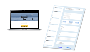
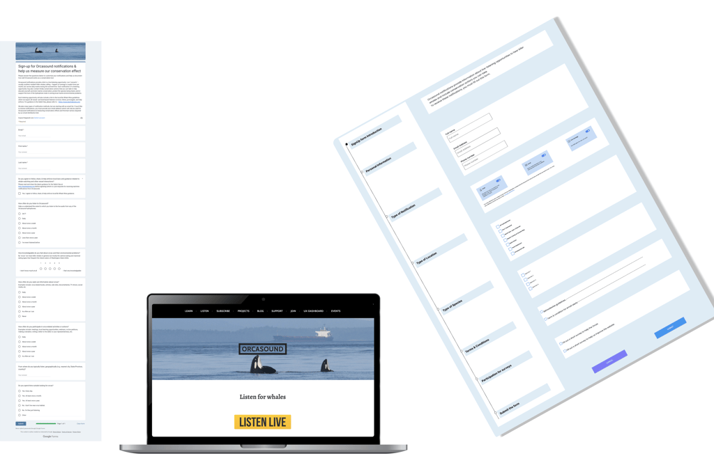
Redesigning a signup form that almost killed an Orca-Listening web App and how we fixed it.
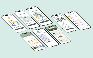
Orcasound
My Work

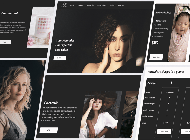
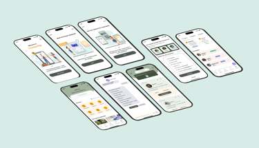
MaryShot
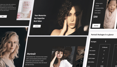
Picture-Perfect booking journey:
Designing an adaptive photography website that makes clients smile.
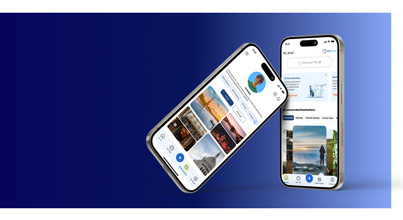
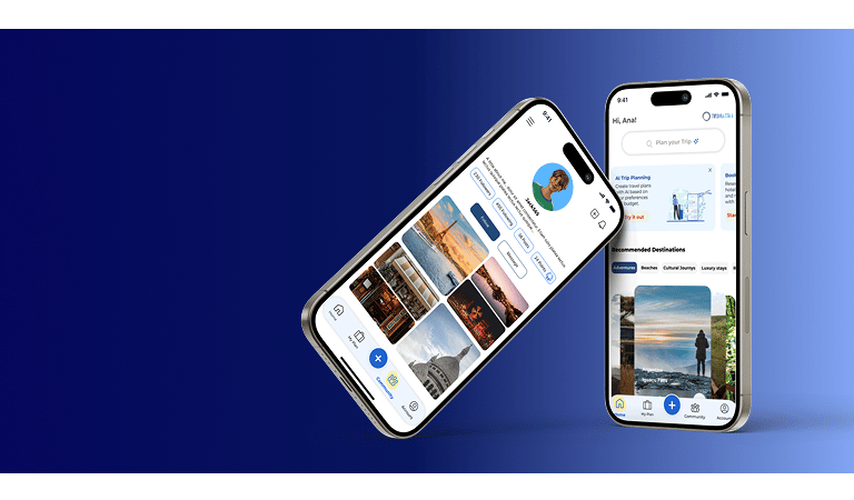
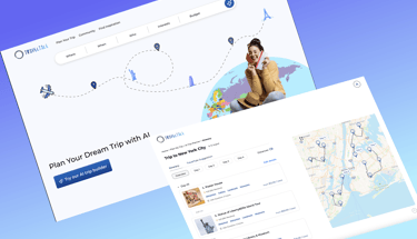
Travel Tale AI
AI-Powered Travel Planning, and
Personalized itinerary
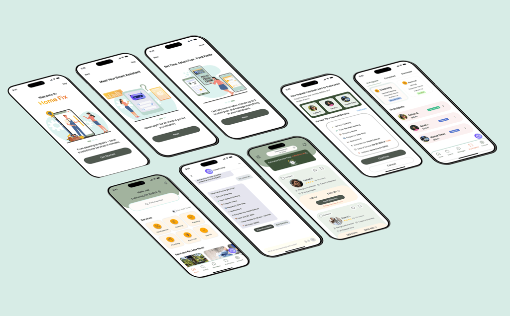
AI-powered app
that helps users quickly book trusted home service providers.
Home Fix AI
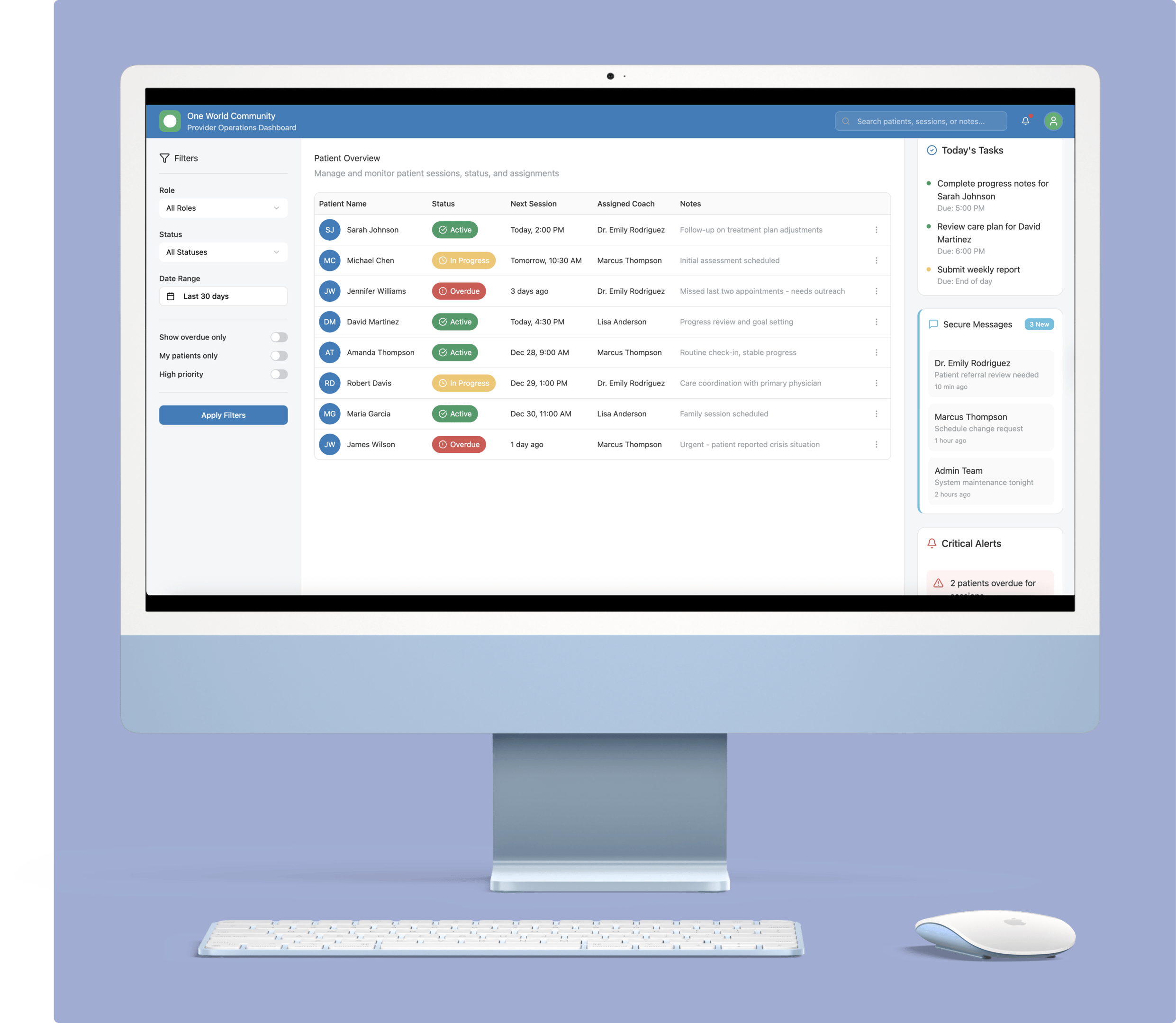
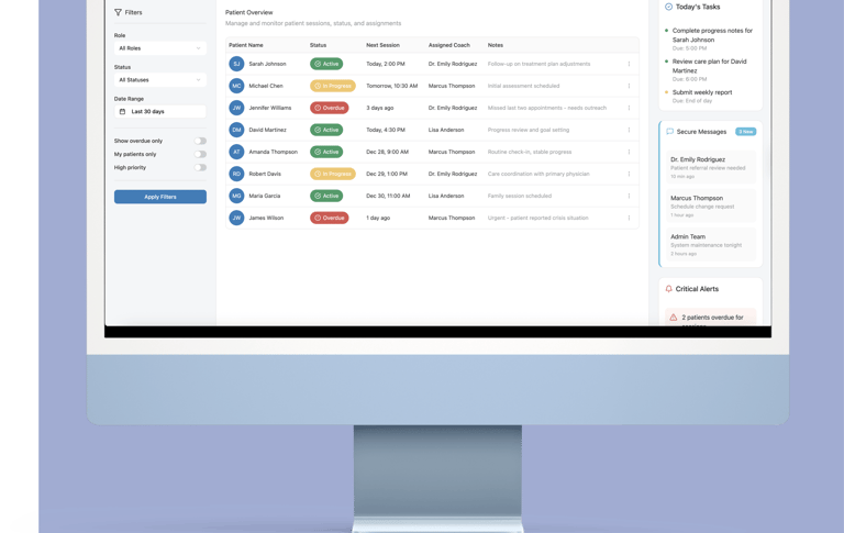
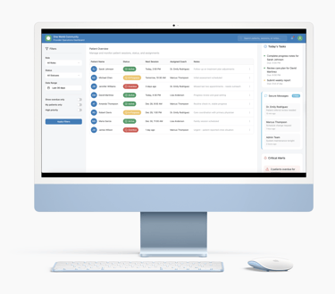
Provider Operations Dashboard
A B2B tool connecting recovery coaches, clinicians, and program administrators through secure, HIPAA-compliant workflows.
One World Community


”Nina's innovative thinking and positive impact on team dynamics made working together a pleasure. I highly recommend Nina for her dedication and ability to drive positive change.”
- Jolleen Opula


”She has shown a clear drive to grow her UX skills. She has planned, written, launched, synthesized, and reported recommendations for a survey study to improve the notification system at Orcasound.”
- Brendan Thatcher
”Even when we were under pressure, she helped keep the environment calm and positive. She also led our usability testing very well and has strong experience in planning and running tests.”
- Arezo Grami
”She was creative, detail-oriented, and always focused on improving user experience. Nina listened carefully to our needs and turned our ideas into beautiful and functional designs..”
- Maryam Borhani
Client & Team Feedback

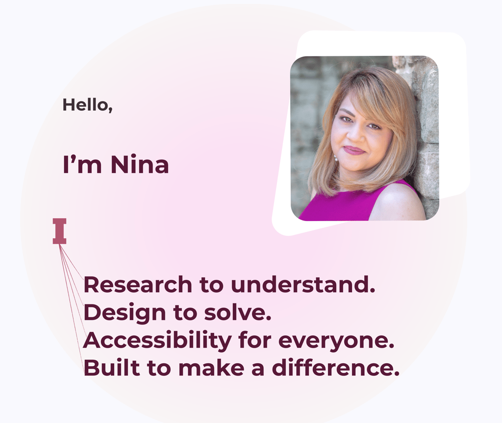
Nina Khezri
UX/UI Designer
My projects